2026 Branding · App Design · iOS Design · Web Design
Alltakt
A brand, a desktop app, an iPhone app and a website for an all-in-one agency tool.
- Year
- 2026
- Agency
- Greenstein.design
- Services
- Branding, App Design, iOS Design, Web Design, Brand Portal, Product Concept
- Brief
- Turn our in-house tool into a product
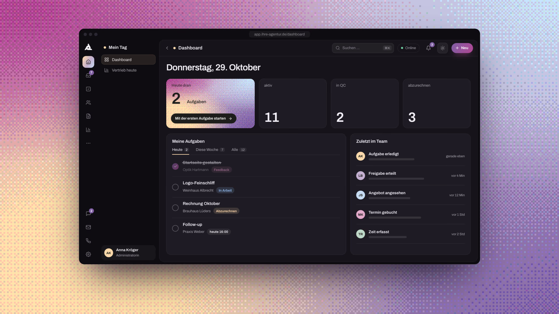
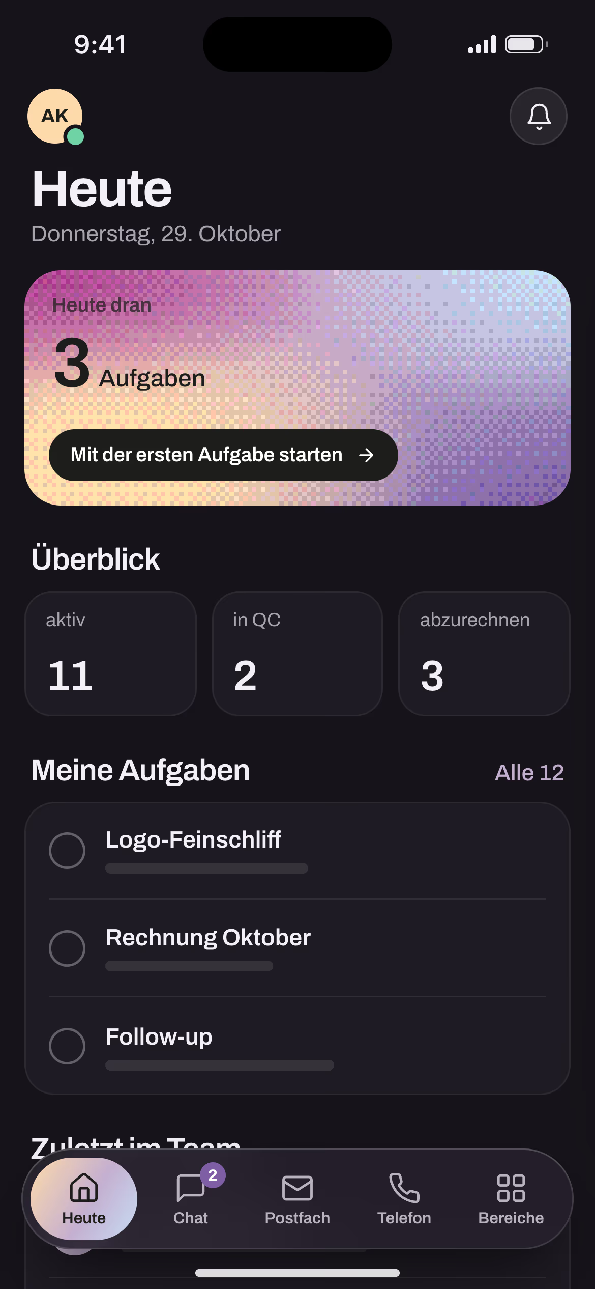
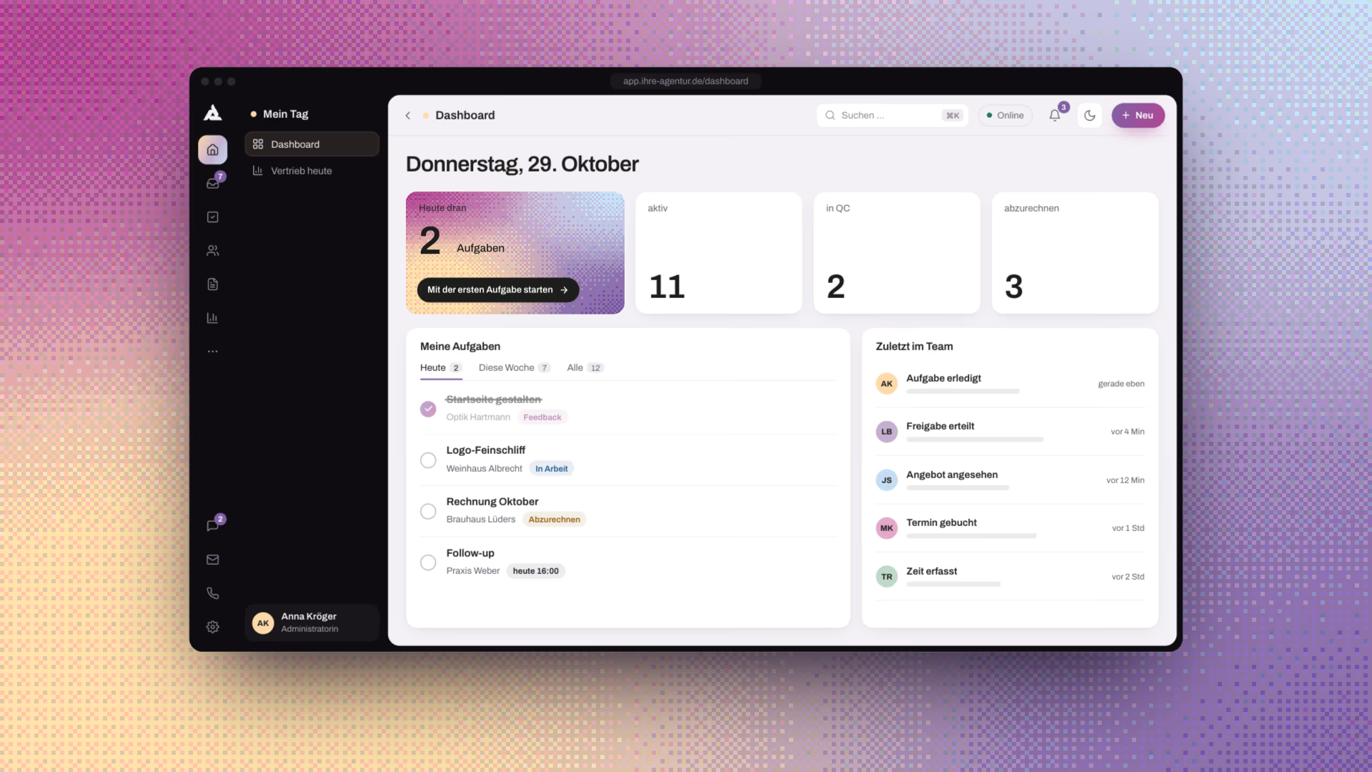
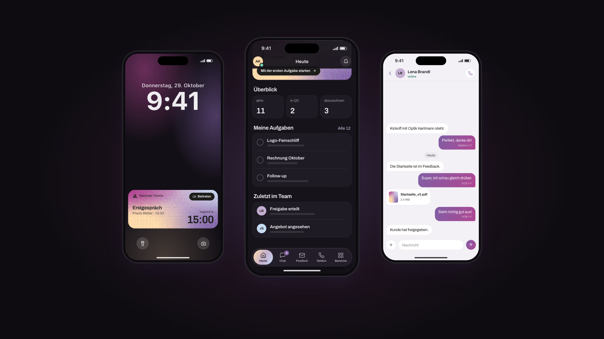
Alltakt started as Greenstein.design’s own platform — one tool to replace the patchwork of PM tool, CRM and phone system. The agency’s owner and I shaped its features step by step, out of how we work every day. When the idea came up to offer it to other agencies and service providers, it needed a brand and an app of its own: I rebranded it, reworked the desktop app in light and dark mode, and designed the native iPhone app, the website and the brand portal. The identity sums it up in a single line, everyday agency life, in rhythm, and builds a calm, confident system around it: a sharp signet, Archivo with an italic serif accent and a pixel aurora. It is laid down in 25 pages of guidelines and carried through stationery and social media into the product, down to the “Heute dran” tile and the Live Activity on the lock screen.
Visit alltakt.de ↗ (opens in a new tab) Open the brand portal ↗ (opens in a new tab)

Claim
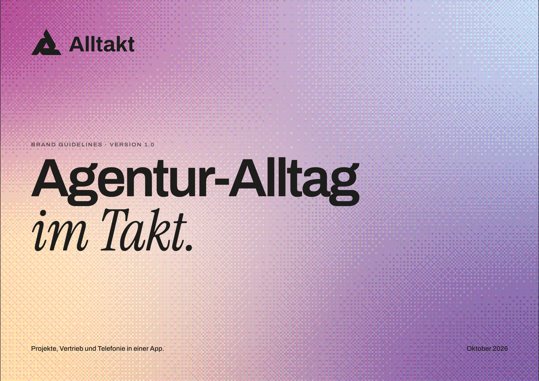
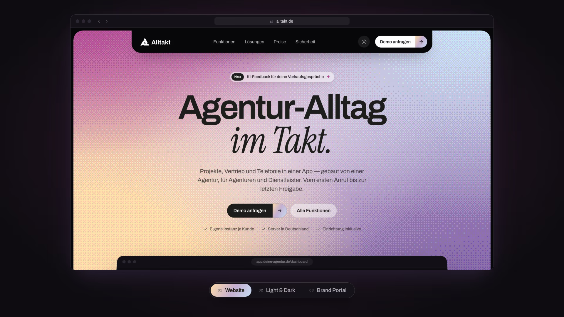
Agentur-Alltag im Takt.
Everyday agency life, in rhythm.
Logo
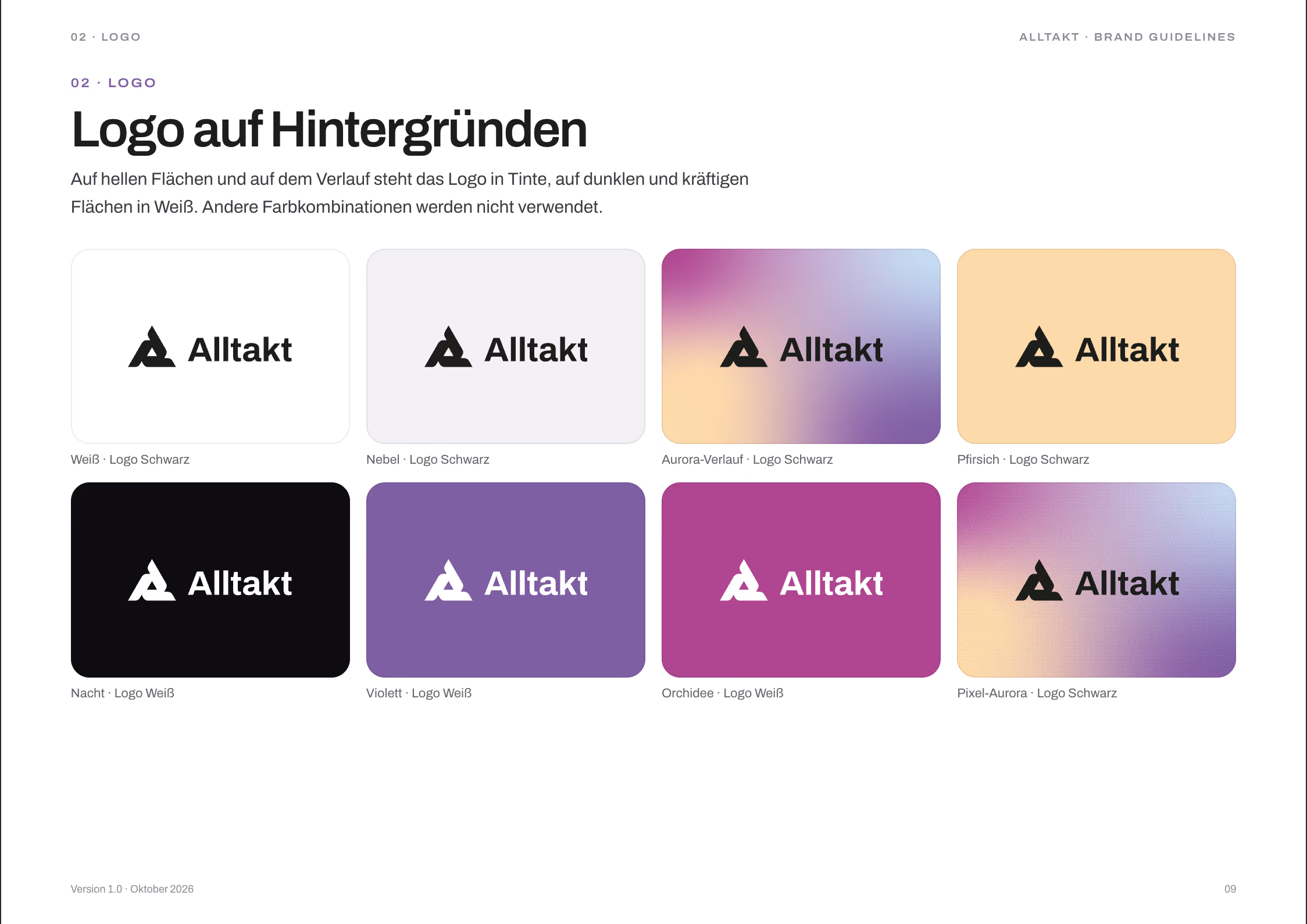
Signet and wordmark form a fixed unit. The wordmark is set in Archivo Bold, the signet folds three strokes into one A.
Colour
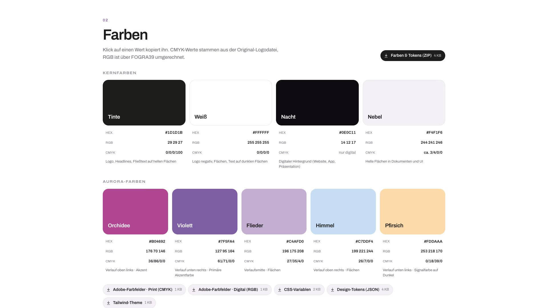
Ink and Night carry the interface. Five aurora tones blend into the signature gradient.
- Ink #1D1D1B
CMYK 0 / 0 / 0 / 100 - Night #0E0C11
Digital only - Mist #F4F1F6
Digital only - Orchid #B04692
CMYK 36 / 86 / 0 / 0 - Violet #7F5FA4
CMYK 61 / 71 / 0 / 0 - Lilac #C4AFD0
CMYK 27 / 35 / 4 / 0 - Sky #C7DDF4
CMYK 26 / 7 / 0 / 0 - Peach #FDDAAA
CMYK 0 / 18 / 39 / 0
Typography
Archivo sets the logo and everything else. Instrument Serif adds a human counterpoint: one italic word per headline, never more.
Projekte.Vertrieb.Telefonie. In einer App.
Product
The features I shaped are the ones I use every day as a designer: projects, tasks, time tracking and chat, project approvals hosted in Alltakt and sent out by email with feedback built in, offers and the client portal, the “Heute dran” day view and the Live Activity on the iPhone. Every feature runs in our own agency first, and the app keeps changing week by week.
- Since March 2026 in real agency use
- 569 changes to the app in 30 days
- 1 instead of 5 one app for projects, CRM, calls, time tracking and offers
Website
alltakt.de carries the brand into sales and explains the product through its four roles — management, project team, sales and client — down to one interactive day in the agency, hour by hour. The app itself is the hero, built in HTML rather than shown as screenshots. Like the app, the site and the brand portal come in light and dark.
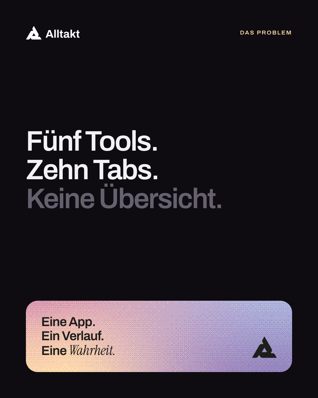
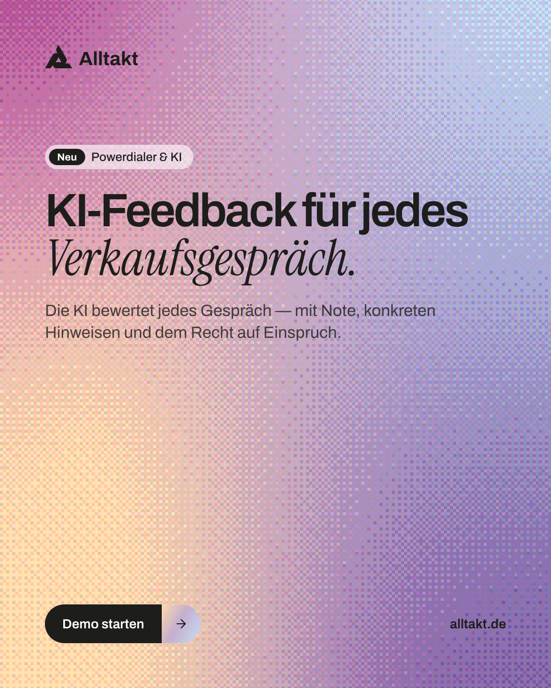
Brand portal
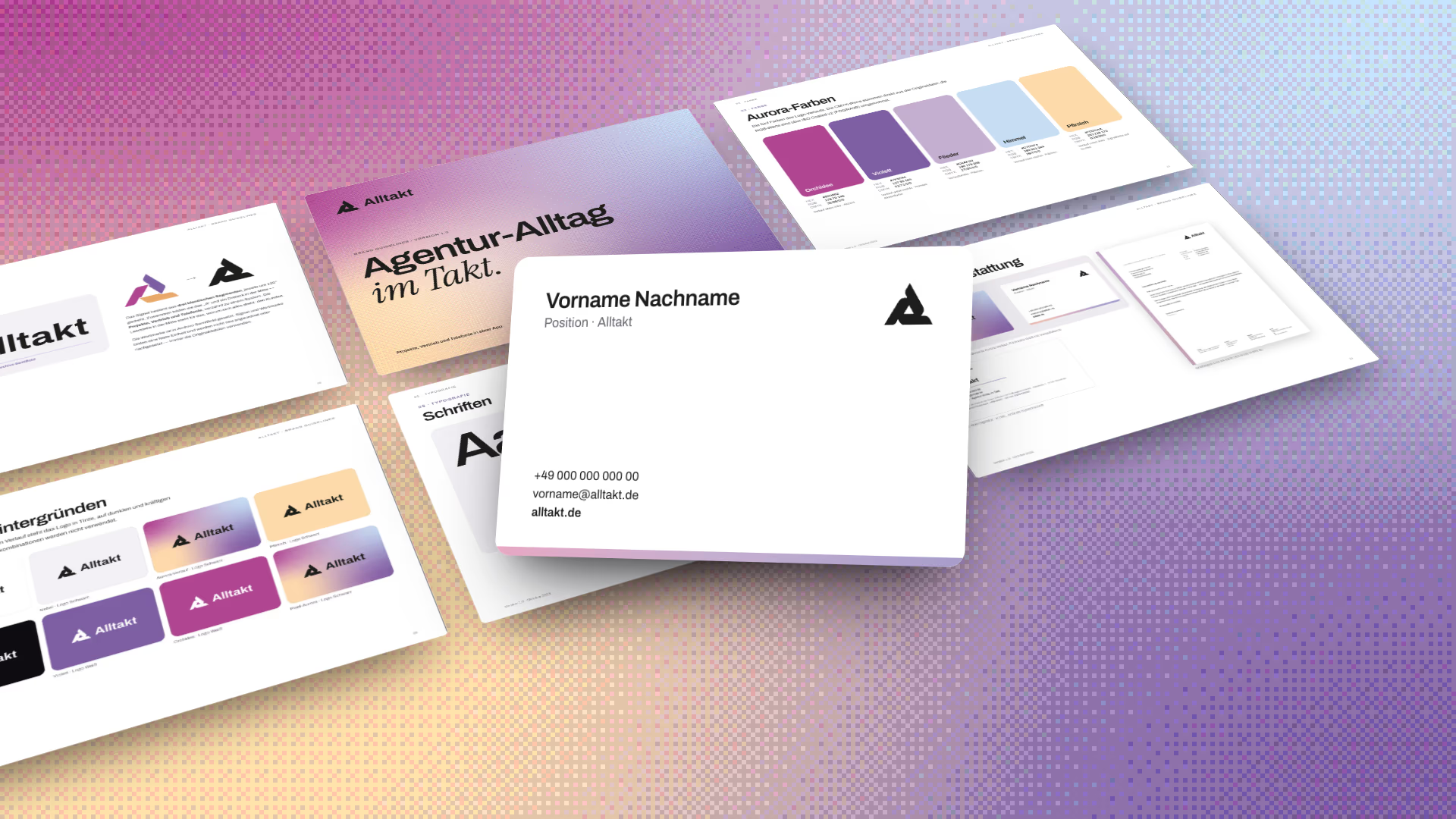
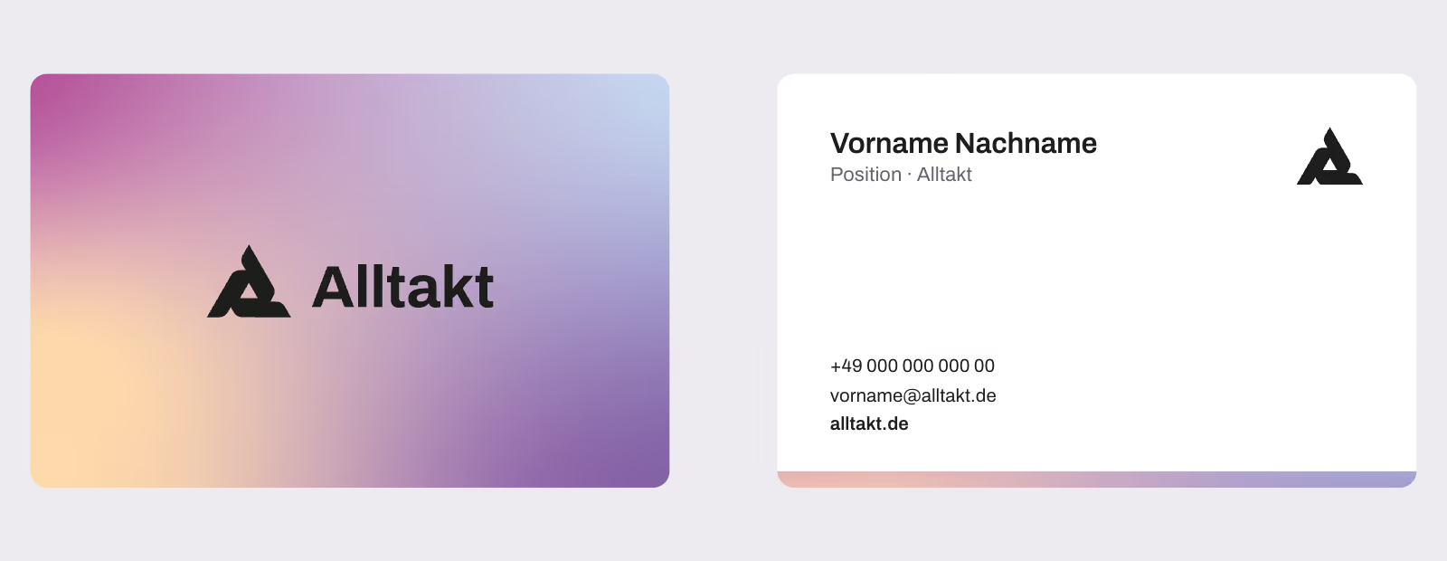
brand.alltakt.de keeps the brand in one place for the team, partners and press: logos in three colours, colours in HEX, RGB and CMYK, the aurora gradient, type and templates for business cards, letterheads, social and reels — 125 files in one package. The colours also ship as design tokens, as CSS variables, JSON and a Tailwind theme, so the brand drops straight into code.