2026 Naming · Branding · App Design · Web Design
Kontor
A name, a brand, an app and a website for a booking platform that had none.
- Year
- 2026
- Agency
- Greenstein.design
- Services
- Brand Workshop, Naming, Branding, App Design, Web Design, Brand Portal
- Brief
- Give an unnamed product a name, a brand and a face
Kontor is a standalone booking and ticketing system for experience providers: wineries, guided tours, courses. The product worked, but it had no name and no brand, only a working title that turned out to be taken. I ran the brand workshop with a competitor analysis, led the naming to Kontor and designed the identity, the guidelines and brand portal, the app and the website. The domain is meant as a call: getkontor.de, get Kontor! Everything grows from one gesture: a lowercase k, written in a single stroke, that pulls into a line with a loop, the place where everything comes together. The line underlines, strikes through, circles and connects, from the twenty-six pages of guidelines to the notifications in the app and the headline of getkontor.de.
Claim
Einmal pflegen. Überall buchbar.
Set it up once. Bookable everywhere.
01 Workshop
The product came first. The brand had to follow.
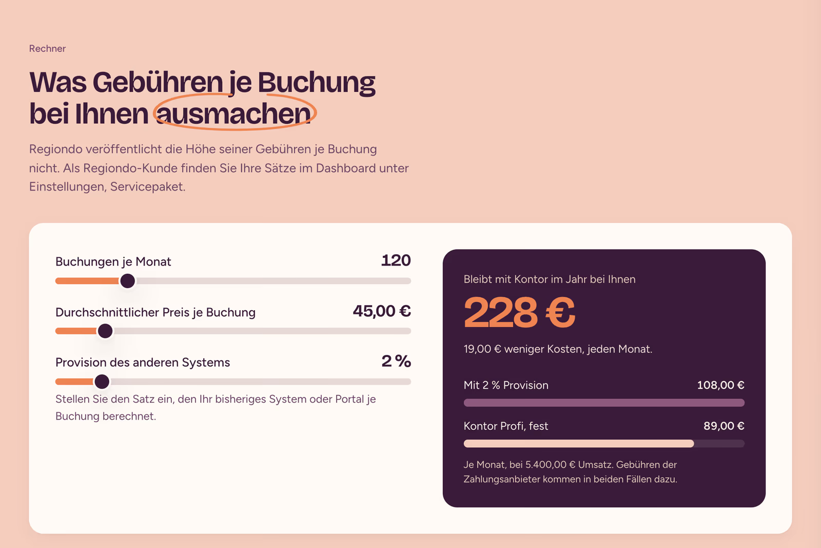
Kontor already did its job, with appointments, tickets, vouchers and payments in one calendar, but it had no name, no story and no face. So before any sketch there was a workshop on the board, following my own method: an inner circle for competence, mission, values and target groups, an outer circle for portrait, tone of voice, touchpoints and story. Thirty competitors and fourteen niches set the ground. The positioning map made the gap visible: nobody combined appointments, tickets and groups with a fixed monthly price and no fee per booking. That corner became the position and the brief for the name: broad, fair, not tied to one industry.
- 30 competitors researched, from Regiondo to pretix
- 14 niches scored, wineries and breweries first
- 0 % commission, at a fixed monthly price
02 Naming
Tourgrid was taken, and too narrow.
The working title belonged to someone else and tied the product to tours. Seven criteria led the search: broad, pronounceable in German, English and Spanish, short, distinctive, protectable and available as a .de domain. Three rounds and around ninety names were checked against trademark registers, domains, app stores and handles. Kontor won: the Hanseatic merchant’s office where every booking comes together and is honestly accounted for, with roots in comptoir, counter and contar. The domain is meant as a call: getkontor.de reads as “get Kontor!”, an exclamation rather than a workaround, while the brand itself stays plain Kontor.
- ≈ 90 names checked
- 3 rounds with trademark, domain and handle checks
- 1 domain as the call to action: getkontor.de
03 Logo
One k, in a single stroke.
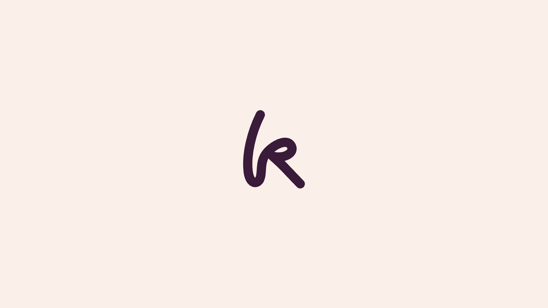
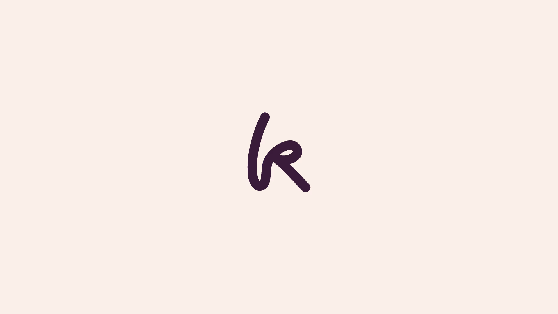
Card wheels, torn ticket stubs, grids and symbols: the first sketches lived as plain SVGs, quick to change and free of any grid. Three concepts made it into the final presentation, each with its own sign, colour and claim: a lowercase k written without lifting the pen, like the old school script; ten bookings slotted into one wheel; the two halves of one ticket. The k won. Familiar to the owners who built their business, fresh for the generation taking it over. Next to the wordmark in Bricolage Grotesque it animates on its own terms: it writes itself, slides into place, then lets go.
One k, written in a single stroke
Concept 1
Einmal pflegen. Überall buchbar.
04 The line
Underline, strike through, circle, connect.
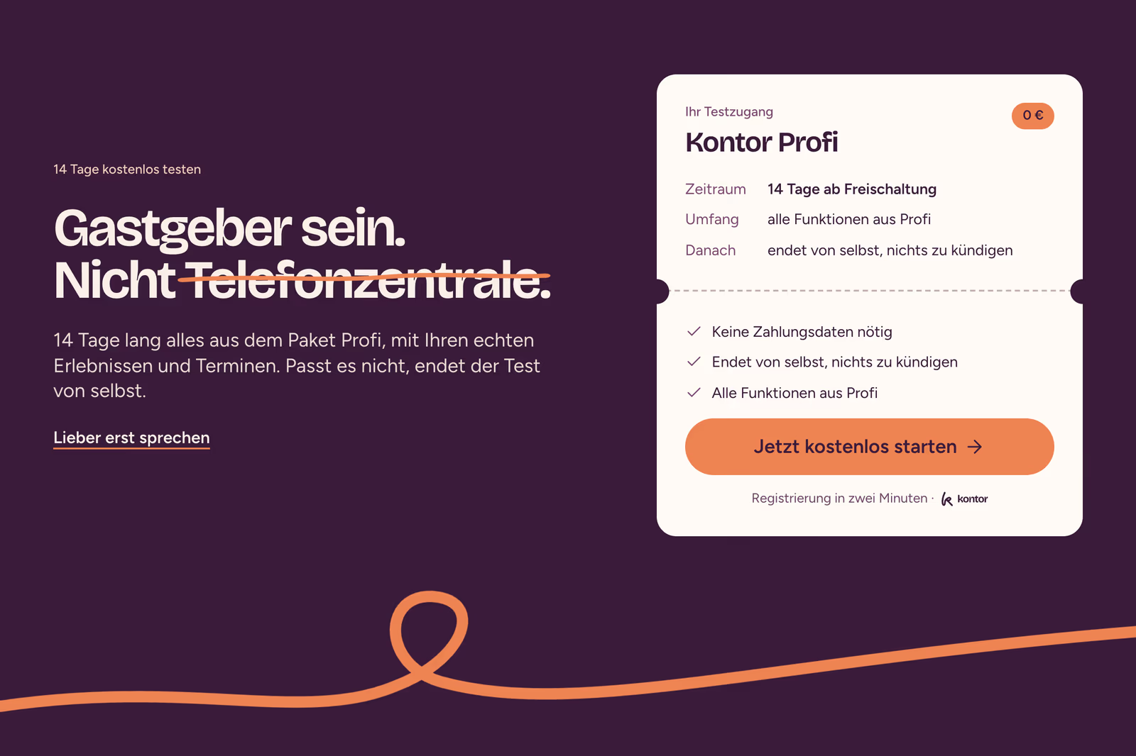
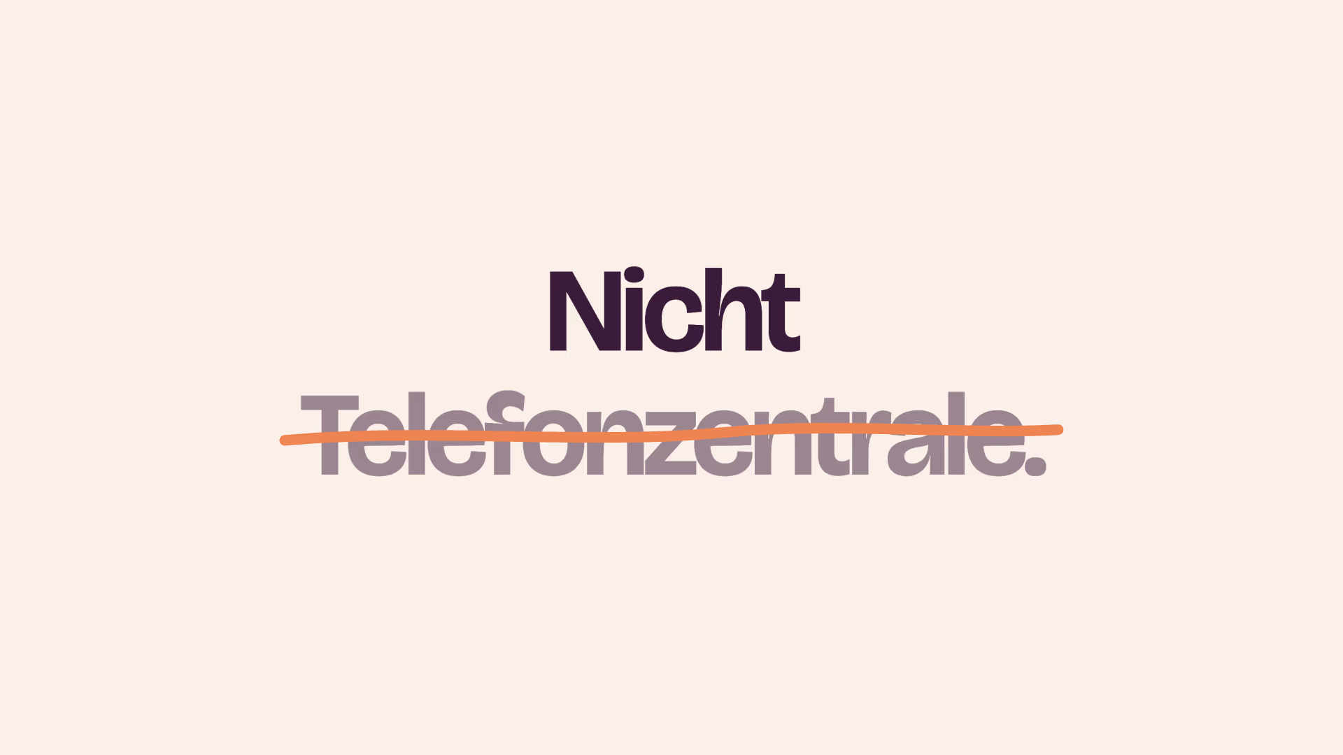
When the k lets go, it becomes the line: Aprikose, round ends, drawn by hand. It replaces a gradient or a pattern as the system element and comes in five forms, underline, strike through, circle, connect and loop. One line per surface, and it always marks something that matters: a word, a number, a photo.
05 Colour & type
Lots of Puder, a little Aprikose.
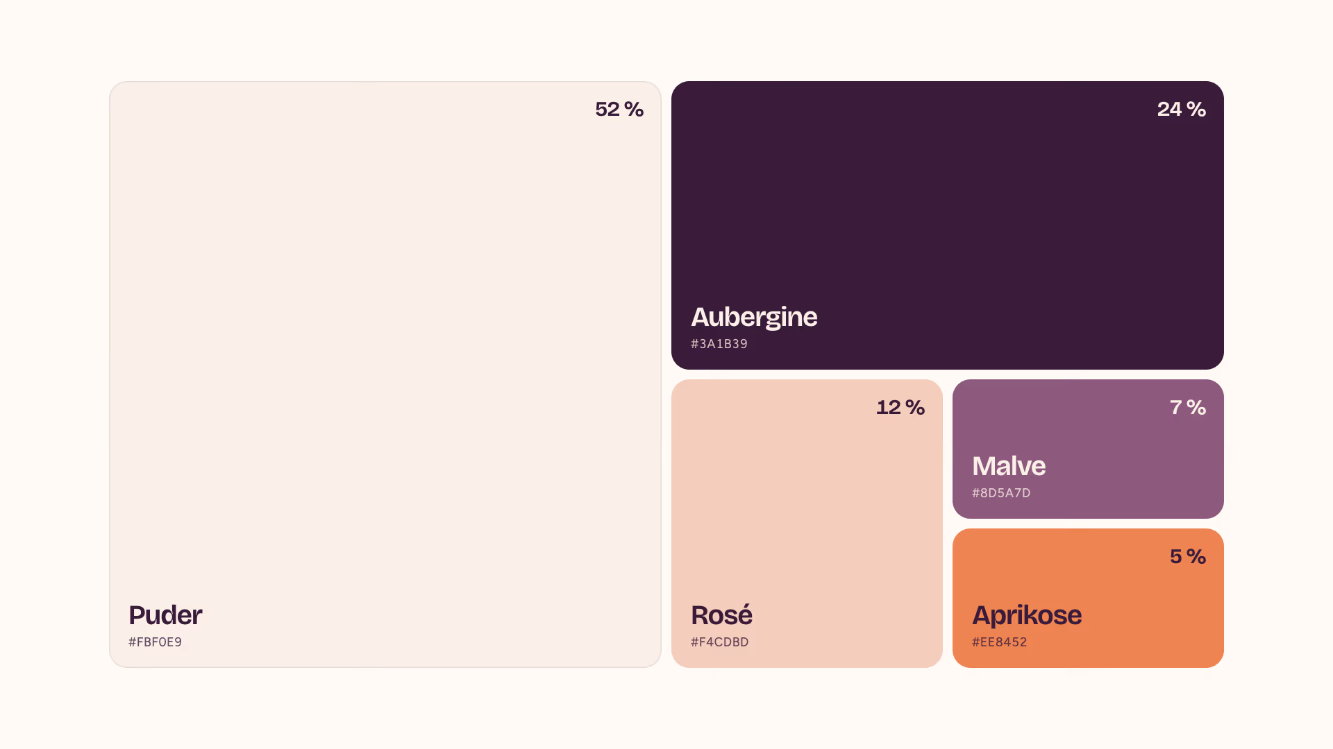
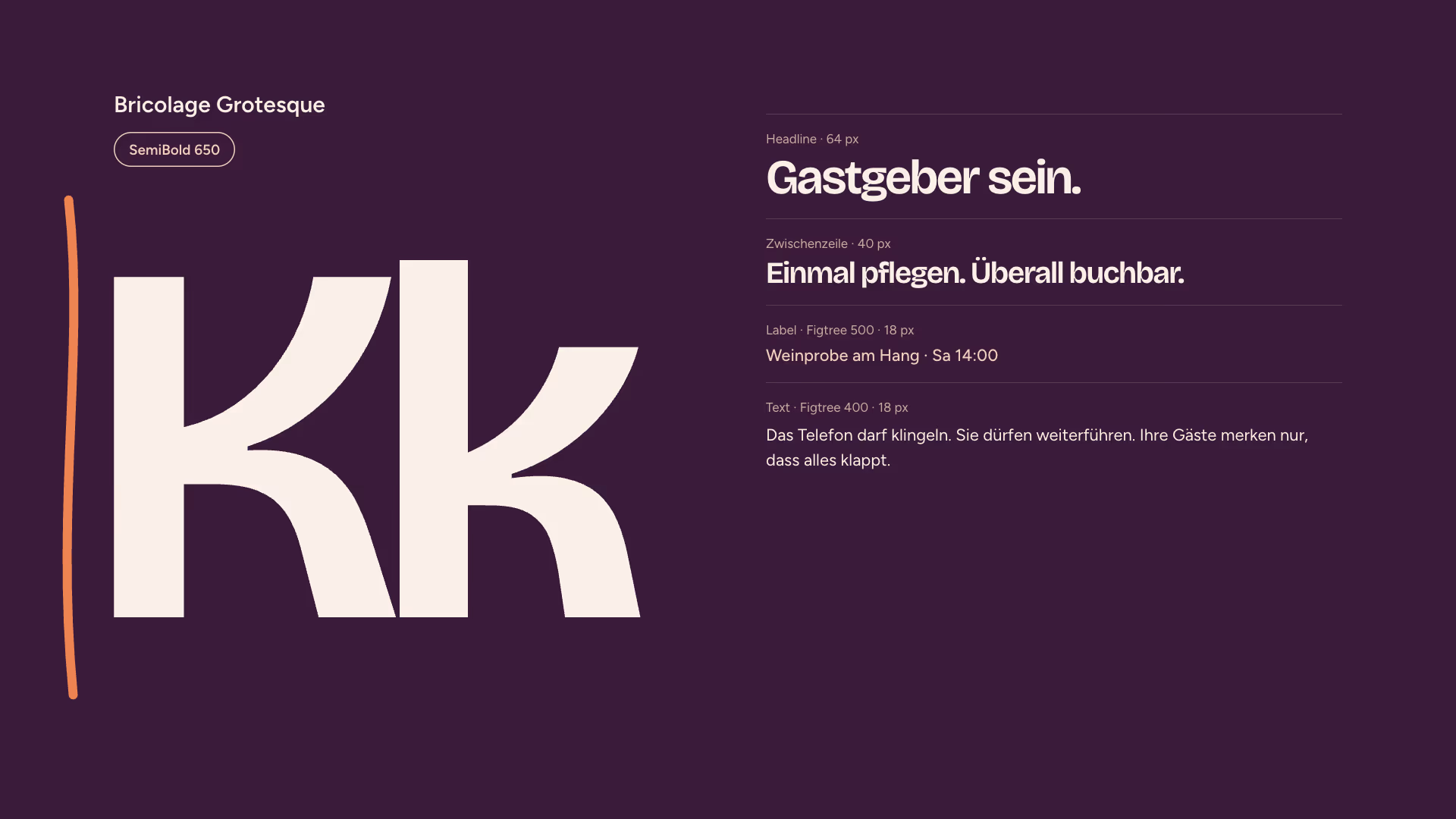
Seven colours, one warm family. Puder as the ground, Aubergine for type and one dark surface per page, Rosé and Malve as companions, Aprikose only for the line and the one button that matters. Bricolage Grotesque sets the wordmark and headlines, Figtree everything else. Both are open source and work in the app, on the web and in print.
06 Guidelines & brand portal
Twenty-six pages, one place to download.
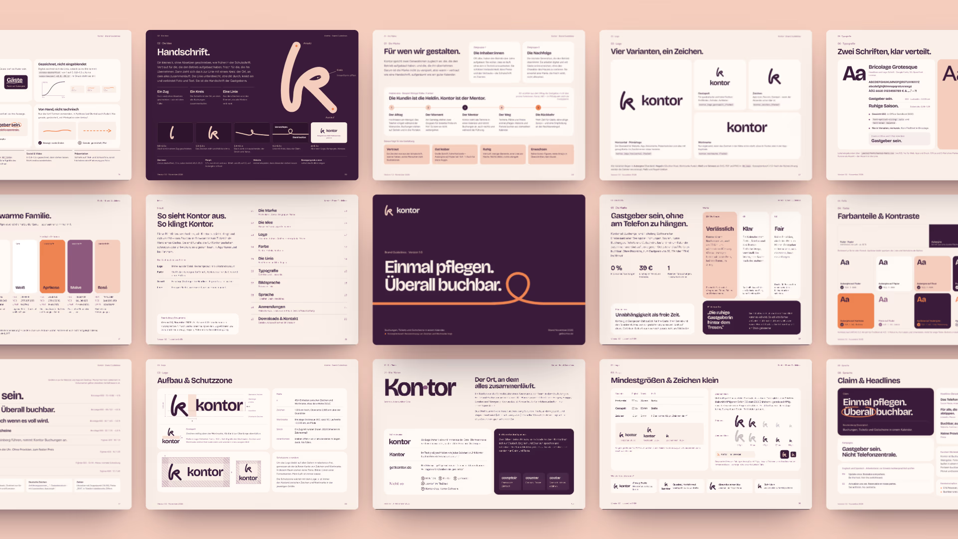
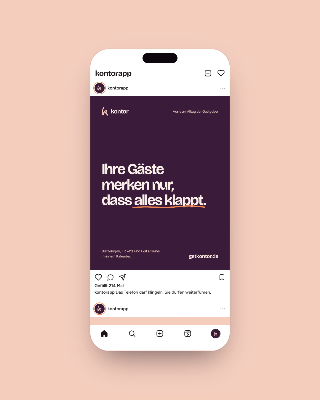
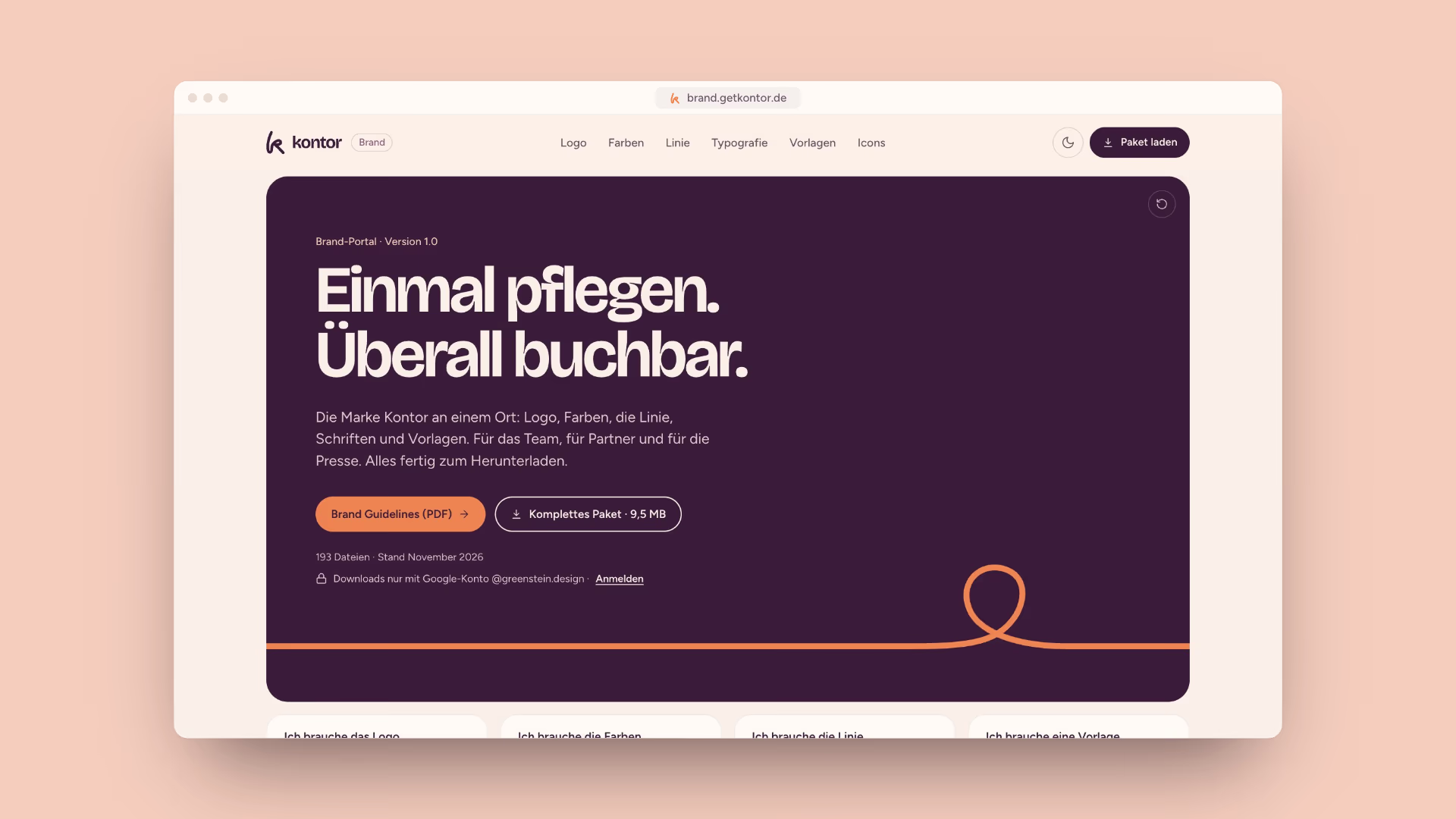
Twenty-six pages of guidelines hold the system together: logo, colour, the line, type, imagery and tone of voice, down to how dates are written. Business cards, letterhead, email signature and social formats follow from it. brand.getkontor.de keeps everything in one place for the team, partners and press: logos in four colourways, colours in HEX, RGB and CMYK, the line as SVG and CSS, and design tokens as CSS, JSON and a Tailwind theme.
07 App
The front desk in your pocket.
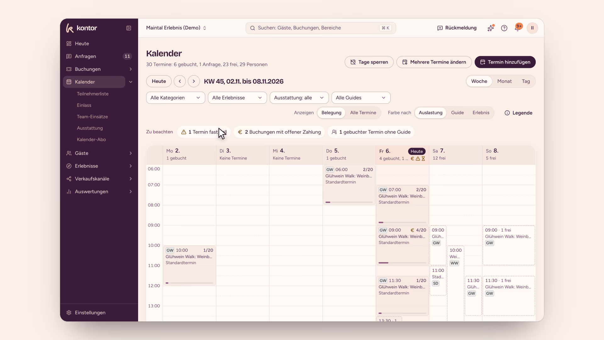
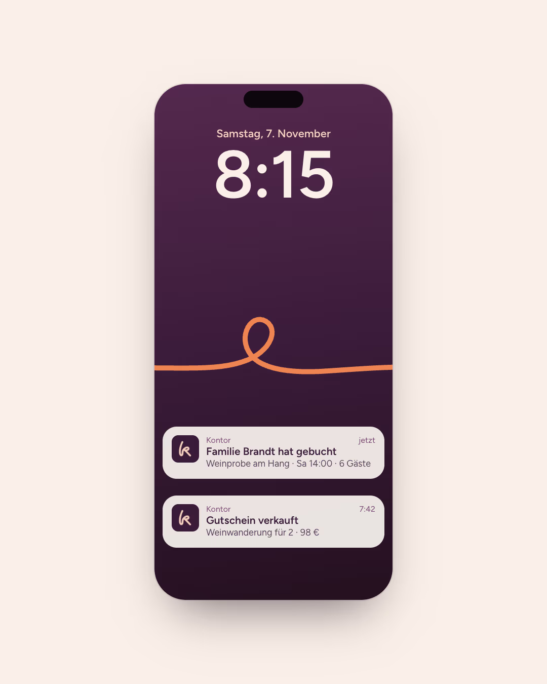
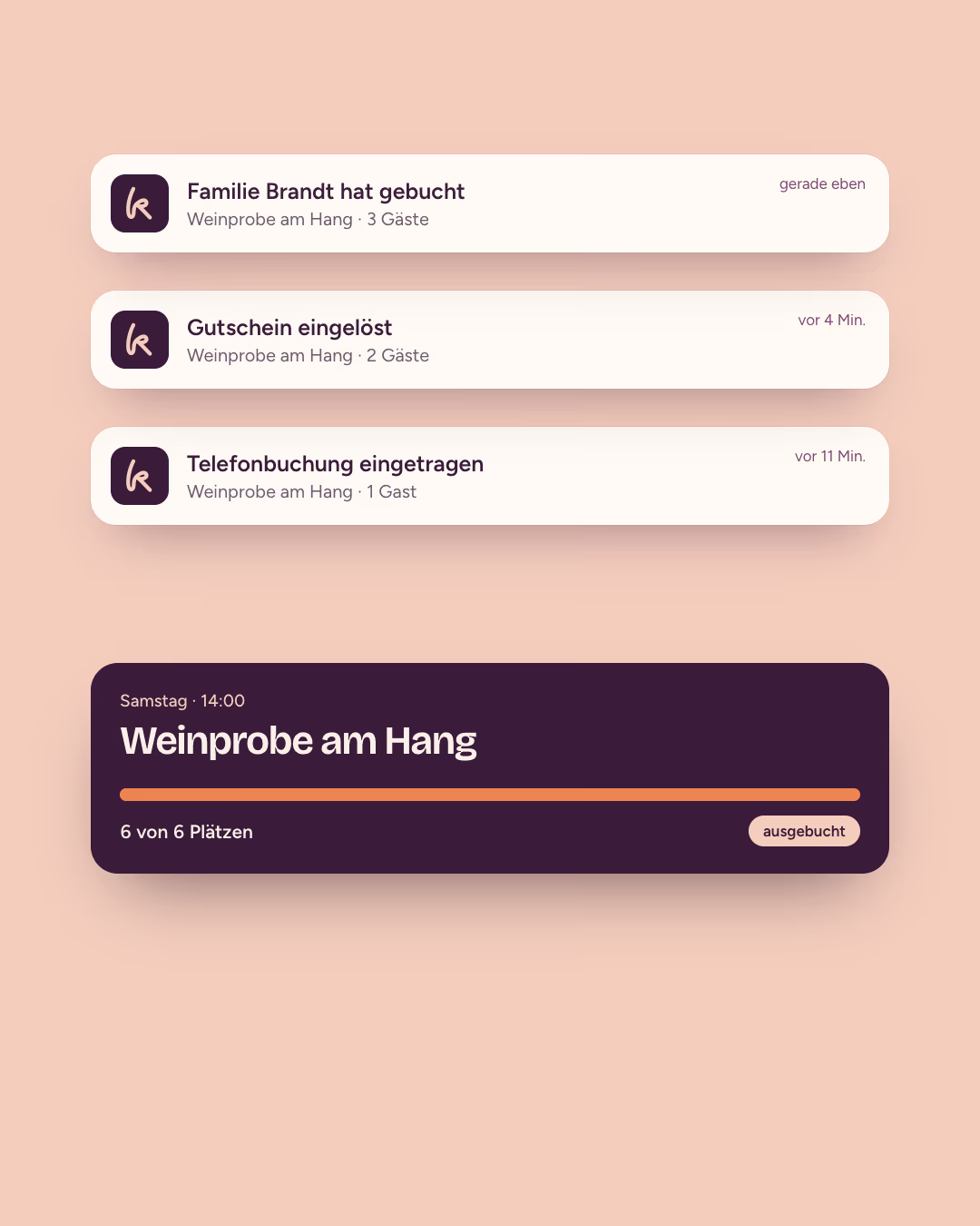
I rethought the app with the brand instead of reskinning it. Puder as the ground, cards on paper, Aubergine for type and a single Aprikose button for the next step. “Heute” answers the first question of the day, the calendar shows how full every slot is, and notifications say who booked what, when and for how many, without any advertising tone. Many owners are older, so everything is labelled and large: a tab bar with words instead of bare icons and 44-point touch targets on the iPhone. Even the emails from Kontor now share one branded layout.
08 Website
Everything in one place. At a fixed price.
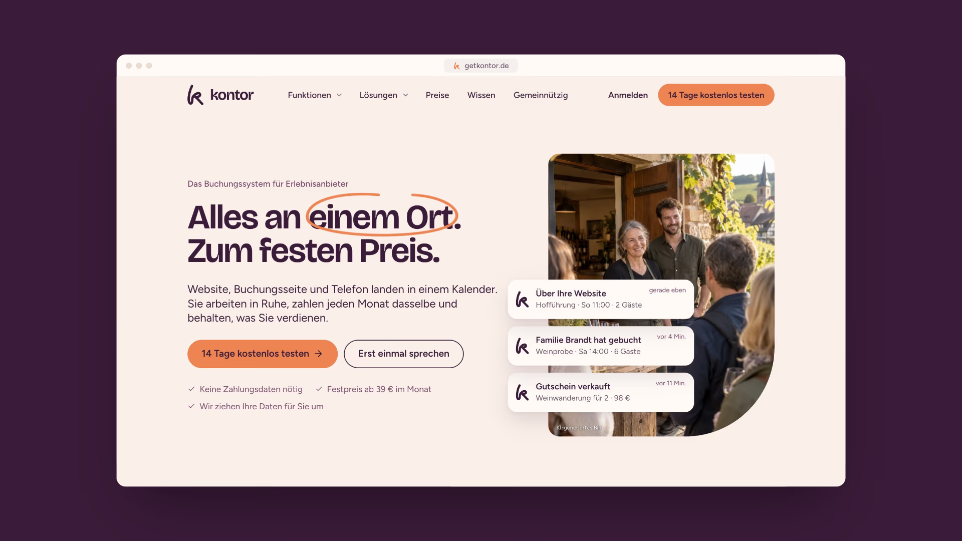
getkontor.de leads with the core message from the workshop: “Alles an einem Ort. Zum festen Preis.” Booking notifications drop into the hero like on a phone, a channel hub shows how website, booking page, phone and box office feed one calendar, and a real calendar walks visitors through their 14-day trial, starting today. Sections alternate between Puder and bold colour panels, and the line only marks what matters.